January 29, 2021
By Brea Jones, Storytelling Intern
Some big changes are afoot at The Wolfsonian–FIU! Over the next 5–7 years, we're set to expand with a preservation-minded upgrade to our existing historic building along Miami Beach's Washington Avenue. To help art lovers far and wide get a sense of what's to come, we've been working hard to create informational packets, a webpage, and now a video.
Husband-and-wife duo Tanya and Carlos Fueyo, owners of Miami-based Playard Studios, helped to bring the magic of The Wolfsonian's plans to life in this 2-minute teaser—a task that quickly became more complicated than it sounds. Though Beach residents overwhelmingly voted to give our project a green light, we have many steps to go before construction begins, including approval from various governing and regulatory boards. Furthermore, whatever architect we select will come to the table with their own unique vision (working within some non-negotiable parameters, of course, such as scope and height). This process begs the question: how do we show off the expansion's feel, rather than the look, which will undoubtedly evolve?
Richard Miltner, The Wolfsonian's chief designer and associate director of exhibitions, explains how the solution was found in placing the objects front and center in the expansion's story.
"We focused on the emotional attachment to letting these objects speak," said Richard. "The video needed to be as evergreen as possible—get to the core of what The Wolfsonian is, and there's a lot, but dwell less on the design specifics of the facility, and more on how everything we do starts with the objects."
"When you view renderings, even conceptual images, you tend to get attached to the details, and here we needed some leeway," agreed Ian Rand, assistant director of marketing, communications + special projects. "But our mission, approach, and collection are constants, so we hoped to play up the idea of more—more to see, more to do, more to experience—and only hint at the spaces. Luckily, Playard understood our parameters."

The Fueyos, both FIU School of Architecture alumni, note that working on the video was a joint creative effort shaped by many back-and-forth conversations with staff and leadership. We had synergy from the start—Carlos, Playard's creative director, and Tanya, producer, share our love for culture and architecture, and both felt a special connection to the project as artists and as fellow Panthers.
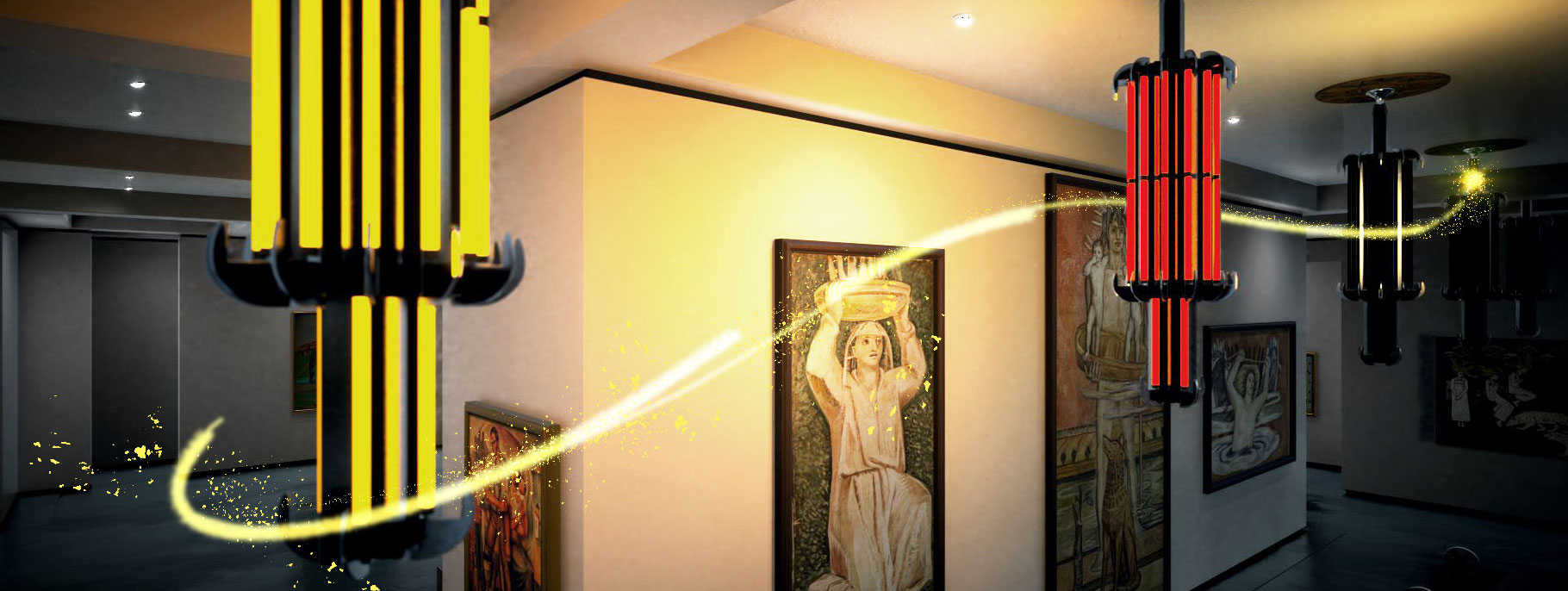
Our mutual respect for the art led to obsessive precision in each and every frame. Carlos and Tanya patiently put up with countless rounds of subtle revisions to address our attention to detail—was the chandeliers' lighting too warm? Does the glow of the radio overwhelm the object? How can we render certain materials and textures more accurately? Can we shy away from showing a whole room, and instead sweep around a corner?
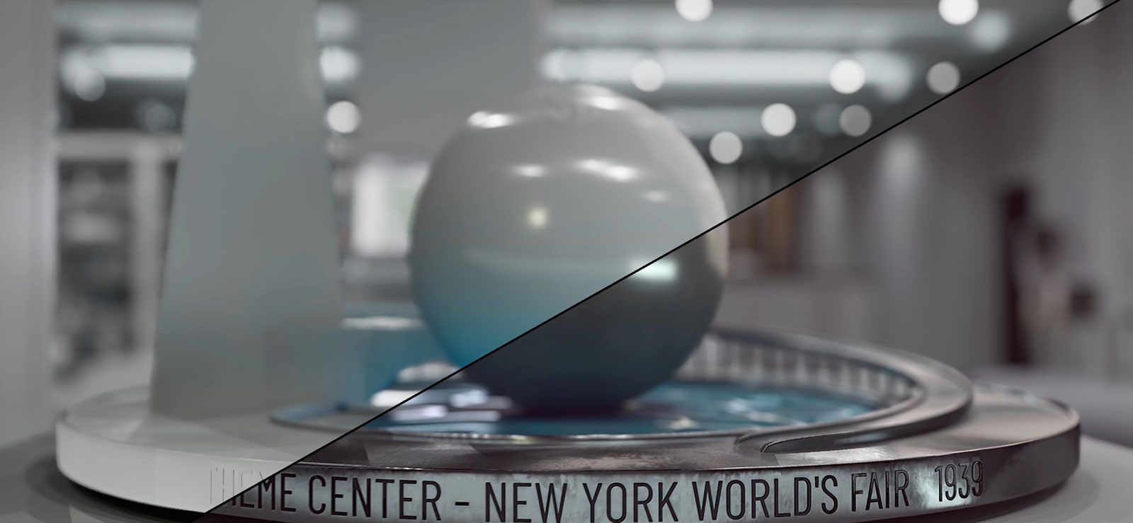
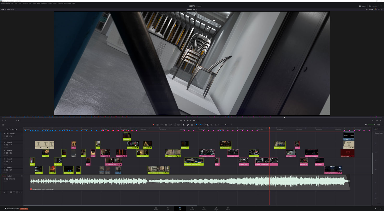
Thanks to new technology from Unreal Engine—powered by Lenovo work stations and NVIDIA video cards—and to DaVinci Resolve, state-of-the-art software for editing and color correction, Playard was able to create and navigate an interactive, immersive virtual world modeled after the conceptual designs. In it, they dropped 3D replicas of Wolfsonian objects including paintings, sculpture, and more, each of which was depicted as true-to-life as possible, a painstaking operation informed by Richard's decades of experience with the collection.
For Carlos, using the Wolfsonian staff's intimate knowledge of the objects was crucial to production: "We didn't have physical access to these pieces, we only had limited views from photographic references, so it was a challenge to recreate them in as much detail as possible." The team pulled out all the stops to mirror the objects faithfully and do justice to the original artists and makers—a process which Carlos has likened to "following breadcrumbs."

Not everything in the collection was fair game, though. Each work of art and piece of industrial design that made the cut was carefully selected to meet essential criteria: 1) well photographed in high resolution; 2) easily recognizable to the eye; and 4) representative of our current thinking for the eventual spaces and their probable curatorial narratives. While some familiar favorites were included, like our Wrestler mascot, most of what viewers will see is new.
"We have many monumental items that are rarely brought out of the vault or have never been displayed because our current galleries aren't large enough. The mural by Buell Mullen [an under-recognized female artist] is of particular interest because of its huge proportions and its capacity to be a prominent feature in a room," said Richard. "By including them in the video, we subtly emphasize how this project is quite literally expanding our horizons."
And despite the many conflicting parameters—show spaces, but don't show spaces; feature the collection, but don't overpack the galleries—Carlos and Tanya created a logical visual narrative without using voiceover or relying on text. The video dreamily progresses through the expansion by gravitating from one object and image to another, sometimes incorporating them into the storytelling itself. In one segment, for example, the Wolfsonian building's evolution from storage warehouse to modern museum is told as the shot pans along a wall of historic photos. One frame starts with a blueprint elevation of the existing structure and then transitions to show a wireframe-in-progress where the addition will go.

Sound is arguably a critical part of any storytelling piece, too. In this video, the music was used to set the right mood. During the planning stages, several options were floated before the group finally settled on Dexter Britain's "Hourglass."
"In a video piece where every little detail is purposeful, soundtrack is key," said Meg Floryan, The Wolfsonian's assistant director of content + student engagement. "I remember one melody was too slow and morose, another piece too energetic, but finally we discovered 'Hourglass,' which felt just right: whimsical, uplifting, calling to mind a sense of wonder. When you hear it, it's easy to imagine floating through the spaces and collection, making discoveries."
Richard said the emotional element woven into the video allows it to become very personal very quickly. "It opens it up, so everyone can have their own take on it. Me, someone who has been around these objects for many decades, might feel differently from somebody coming to it fresh."
And that was the goal all along—although the Fueyos have both studied and appreciate architecture, they tend to shy away from the type of cookie-cutter architectural flythroughs that have become more expected, instead aiming for something "engaging, beautiful, theatrical, and cinematic." Mission accomplished, team.
