
July 27, 2020
By Oscar Rieveling, Education Manager
Our interaction with the deluge of images we encounter in today's digital landscape is frequently reduced to an absent-minded scroll. With a limited window for seizing our attention, marketers and activists turn to design to punch up tone and lure the eye. One method for achieving this is to draw from and remix existing images to reference the past and evoke emotion.
This week, we'll be taking a close look at inspiring change through graphic strategies in our Designing Activism program, co-hosted by curator Shoshana Resnikoff and Dale Zine artists Steve Saiz and Lillian Saiz Banderas. With this conversation on the near horizon, I'd like to take some time and space here to consider how activist design can be nourished by historical source material (like the kinds of images you'll see below) to accentuate message.
Methods
Grounding new work in history is one tactic for developing resonant protest graphics. Whether alluding to past events or honoring the achievements of activists who came before, an image can be strengthened by showing direct influence from existing source material. Many artists and designers thus engage in a robust research phase—a process of enriching their projects by associating them with a cause or expressing solidarity. Some might see this stage as similar to that of curating a mood board, created with the intention of refining an approach and tone.
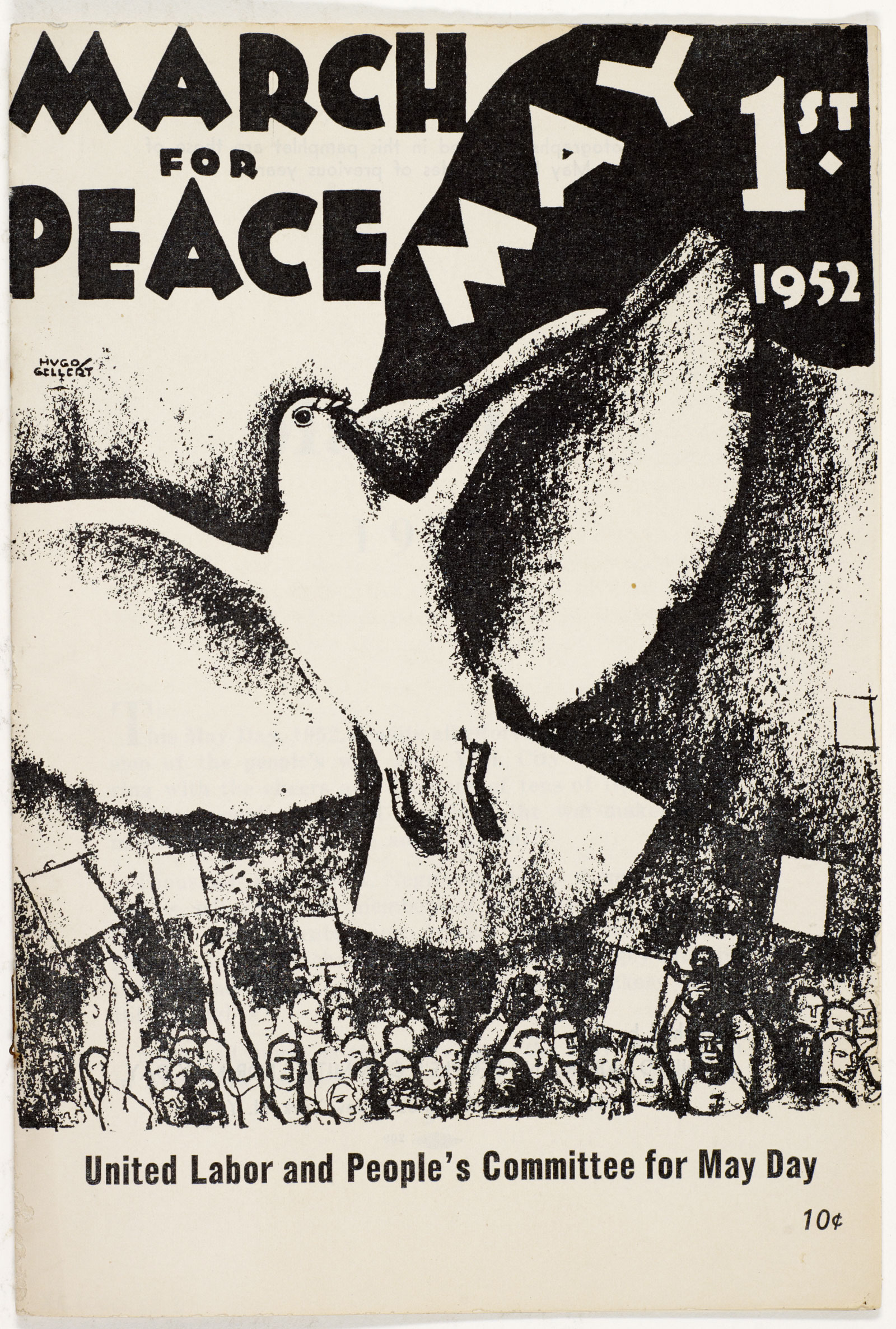
Pamphlet, March for Peace, 1952. Hugo Gellert, illustrator. United Labor and People's Committee for May Day, New York, City, publisher. The Wolfsonian–FIU, XC2000.53.3.
Beyond this visual research about past works, there is also room for pulling inspiration from specific graphic elements in the primary sources. Whether looking broadly at composition, or zeroing in on color scheme, font type, or a specific text, creatives often "quote" from past works to make something new, sometimes incorporating multiple allusions or influences for a layered effect. In this manner of sampling and remixing, historical material can be updated for contemporary sensibilities.
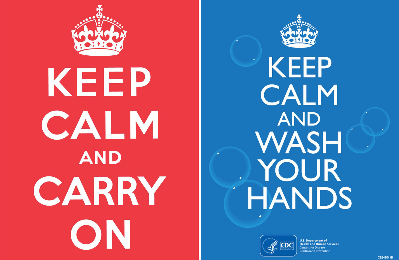
Left: Poster, Keep Calm and Carry On, 1939. Ministry of Information, London. Right: Poster, Keep Calm and Wash Your Hands, 2014. U.S. Department of Health and Human Services, Centers for Disease Control and Prevention, Atlanta.
The now-ubiquitous Keep Calm and Carry On poster is one example, created by the British Ministry of Information in 1939, at the onset of the Second World War. Although never actually distributed during the war, it was rediscovered in 2000 at a used bookstore in the UK, and has since become iconic—so much so that it has been reinterpreted through a variety of lenses, some still in line with its initial morale-raising intent, others for commercial purposes or to comic effect. Another instance of a contemporary update is the British Royal Navy's 2018 riff on the famous war-era "Loose Lips Sink Ships" mantra, which encouraged Americans to avoid careless talk that might be overheard by foreign spies. Modifying the message to read "Loose Tweets Sink Fleets," the new poster speaks to the dangers of sharing information on social media, aligning this 21st-century security threat with that of the older propaganda campaign.
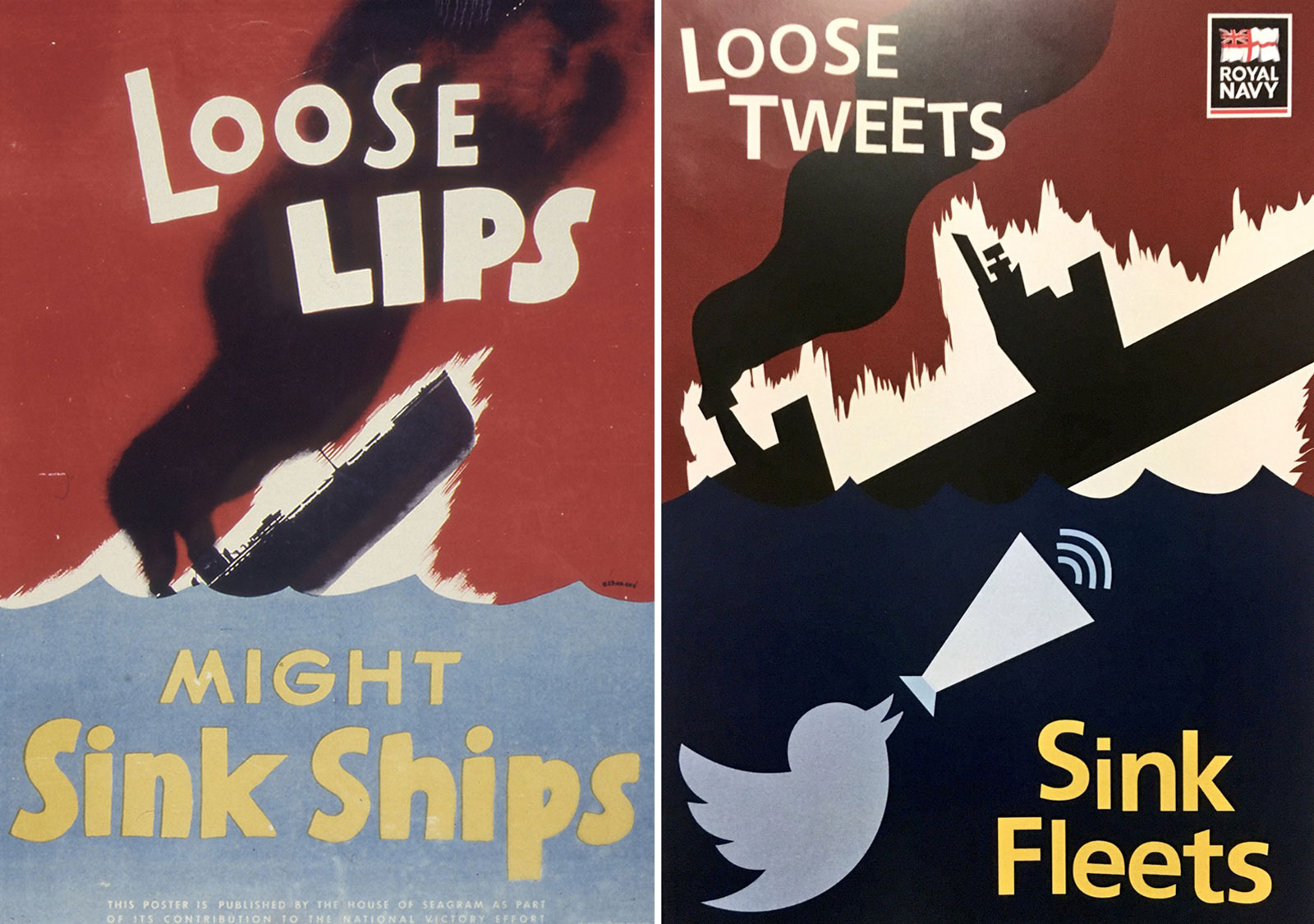
Left: Poster, Loose Lips Might Sink Ships, 1941–45. Seymour R. Goff, designer. Seagram – Distillers Corp., New York City, publisher. Right: Poster, Loose Tweets Sink Fleets, 2018. Royal Navy, London, publisher.
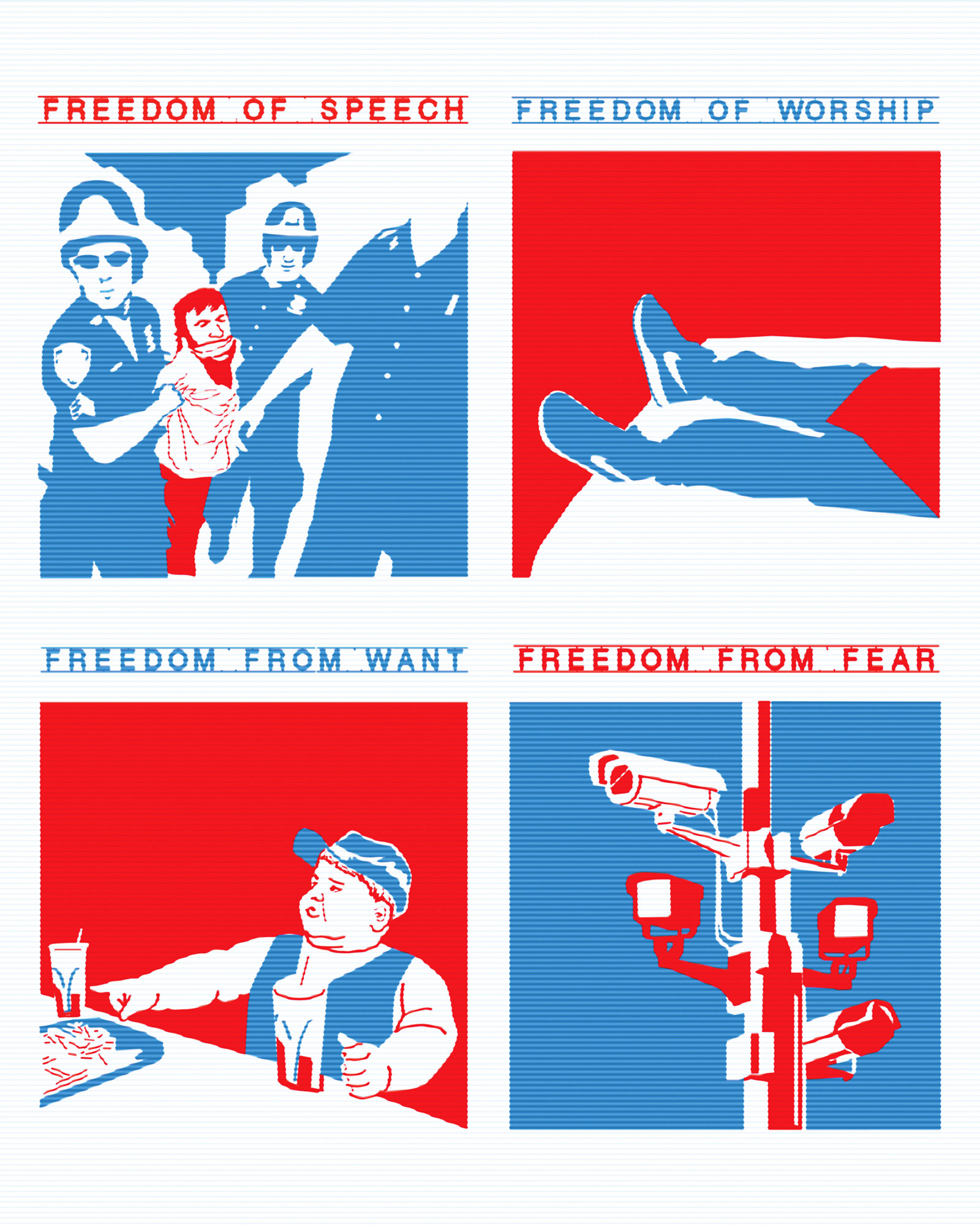
One past Wolfsonian project exemplifies this approach to reworking historical design: our 2008 exhibition Thoughts on Democracy: Reinterpreting Norman Rockwell's Four Freedoms Posters. In the lead-up to the 2008 presidential election, 55 contemporary artists and designers created new graphic works inspired by American illustrator Norman Rockwell's "Four Freedoms" posters of 1943, which spoke to President Franklin D. Roosevelt's vision of "a world founded upon four essential human freedoms"—Freedom of Speech, Freedom of Worship, Freedom from Want, and Freedom from Fear. Adam Lewin, one of the participants, updated Rockwell's posters in a revised version that questions the perceived "freedoms" of a post-9/11 America with graphic representations suggesting our reality doesn't quite line up with the values and hopes expressed by the original slogans.
It's worth noting that with instantaneous online publication and circulation, images can lose their original contexts in a dynamic exchange that makes them subject to new interpretations, riffs, and manipulations, ones perhaps wildly different from their starting points. We needn't go far—take our current moment of political upheaval, pandemic, and reckoning with systemic racism—to realize how rapid-fire reposting and remixing can strip an image of its origin story, earning nationwide denouncement. Moments of high tension and cultural reckoning like the one we find ourselves in now emphasize the need for context and thoughtfulness if the weight and seriousness of these issues is to be conveyed in a graphic that will be viewed and judged in a split second.
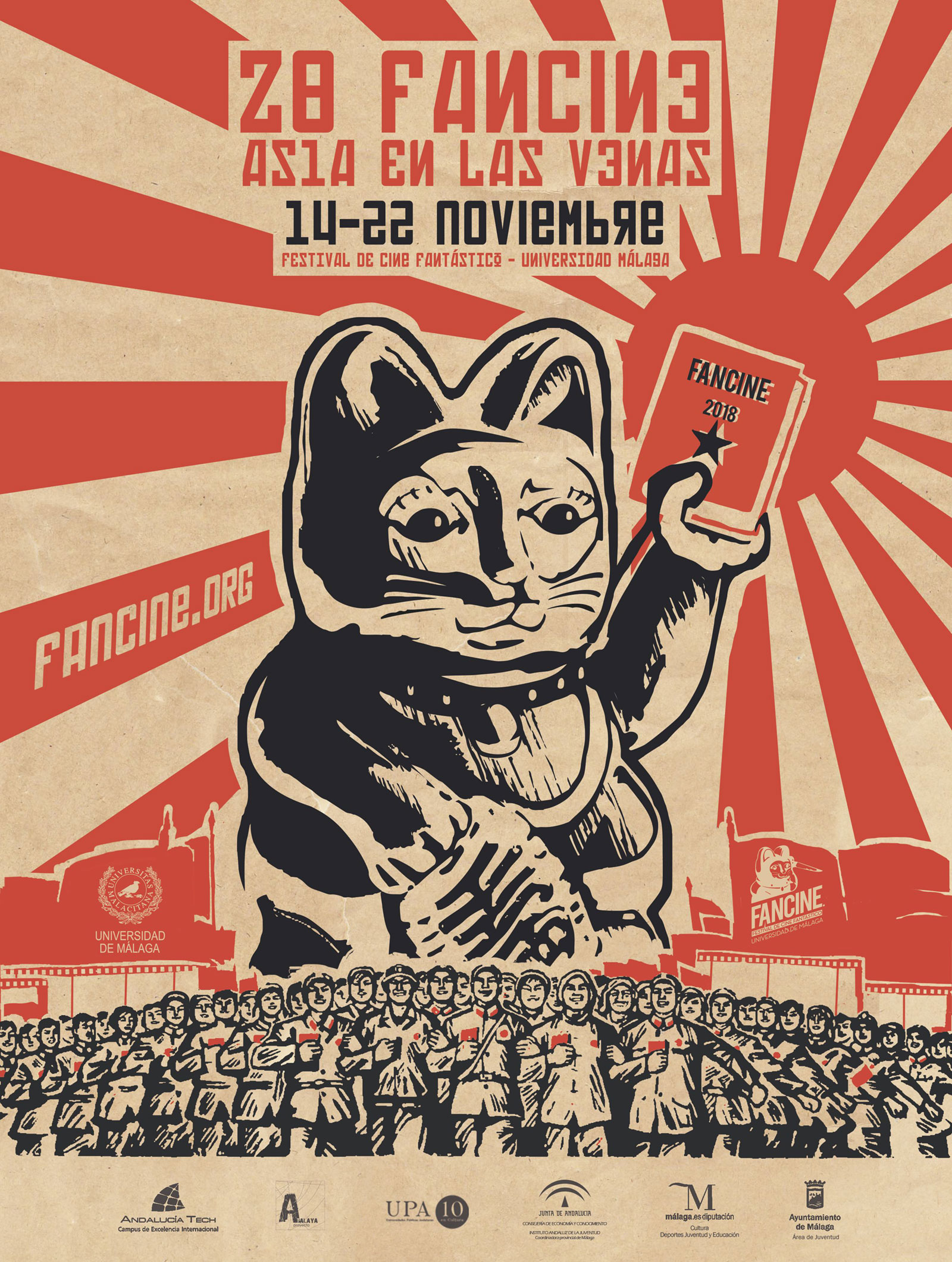
One instance of sourcing gone awry is found in this poster (above) promoting the 2008 Fancine Fantastic Film Festival in Malaga, Spain. The design derived inspiration from the festival's focus on Asian cinema, particularly propaganda imagery of the Mao Zedong era. However, it was the inclusion of the Japanese Rising Sun flag in the background that prompted public outcry, especially among the South Korean community who associate the flag as supporting the crimes and militarism of the Imperial Japanese military during the Second World War. Upon pressure from South Korean diplomatic authorities in Spain, the poster was swiftly modified and a public apology issued, leaving us with an important lesson in acknowledging the histories of the graphic material we might look to pull from.
Since less-recognizable images might not carry easily accessible documentation of their original context, designers benefit from taking the time to become as aware of a historic image's backstory as they can. Knowing a work's creator, the reasoning behind their visual decisions, and the full conditions of its creation all help a new design resonate with authenticity and integrity. Online, this information often isn't readily available after an untraceable chain of repostings—appropriator, beware!
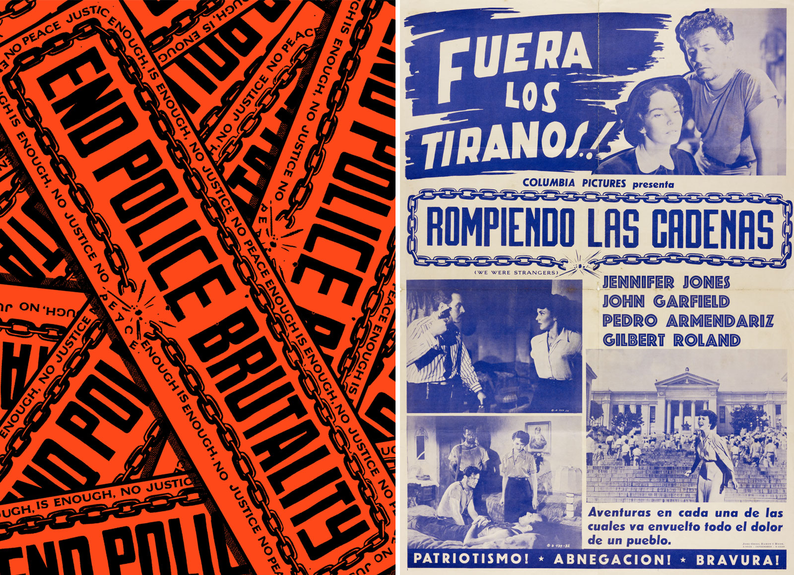
Left: Poster (2020) by Dale Zine. Right: Poster, Rompiendo las cadenas [Breaking the Chains], 1950. Columbia Pictures, Los Angeles. José Oriol Ramos y Hermanos, Havana, printer. The Wolfsonian–FIU, The Vicki Gold Levi Collection, XC2002.11.4.367.
To illustrate thoughtful sourcing, we can turn to one piece from Dale Zine's recent activist work. The Miami-based artist duo (along with many other creatives) have been lending their design services for free to those fighting for social justice. To do our part, we invited them to look at a selection of images from the Wolfsonian collection and put their own spin on the material. The resulting design is the orange and black poster on the left, which was derived from an unexpected source: a 1950s Cuban film poster for Rompiendo las cadenas [Breaking the Chains], seen here on the right. Dale Zine isolated the Cuban poster's central chain graphic and updated it to reflect the concerns of Black Lives Matter—unfair treatment by the police and systemic racism—but the new use is still very much in keeping with the spirit of its inspiration, a poster for a movie about a revolutionary coup. Neon orange coloring like that of construction signage makes the graphic pop and emphasizes its urgency.
For researchers and artists looking for a historical fix, The Wolfsonian publishes thousands of images of our objects online, with new images constantly being added. A special sampling of works vetted by our team, selected for their high relevance to current critical conversations on race, is included below. Among the plethora of other public databases, we hope this becomes a resource to help artists and activists find inspiration—and rich information—for their next creative projects.
Collection Picks
Below are brief write-ups to give you a better idea of how four Wolfsonian images functioned in history. We've also included thoughts from Dale Zine about the design choices that make each piece impactful.
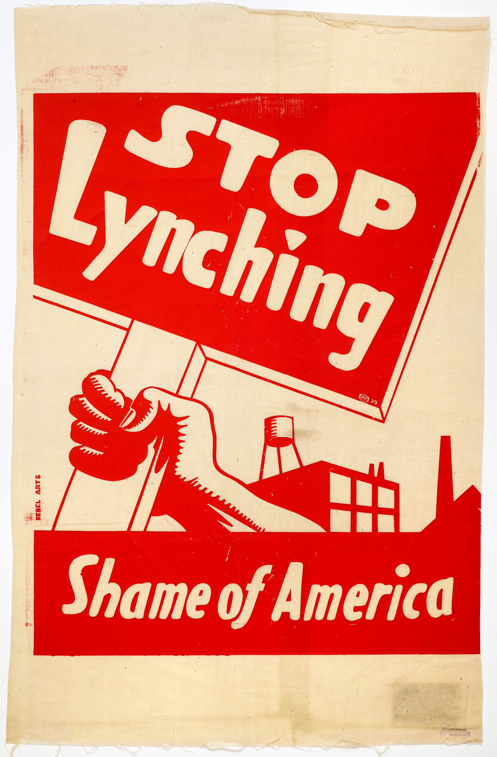
Anti-Lynching Banner
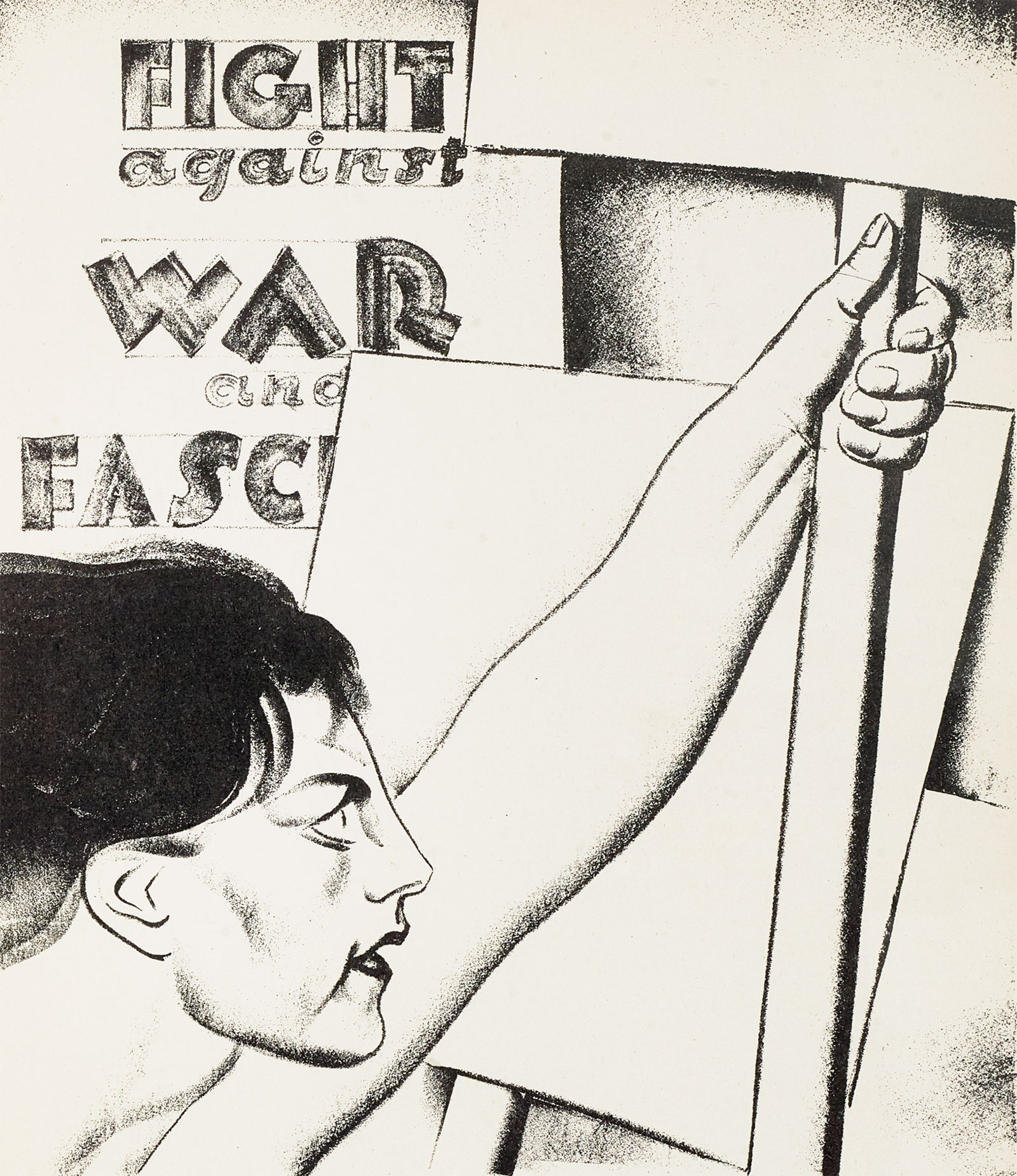
Showing a brawny arm holding a sign in front of a factory, this banner positions the industrial working class at the vanguard of opposition to violence against African Americans. Although lynchings had become less common in the 1930s than in earlier decades, the threat of racial violence was still very present in the national consciousness. During a 1939 rally aiming to intimidate black voters in Miami, members of the Ku Klux Klan displayed nooses from their cars. The Rebel Arts Group was a New York-based artist cooperative founded in 1934 by students and members of the American Socialist Party, the Workmen's Circle, and other leftist groups. Famous for theatrical and musical performances, they also produced murals, publications, and protest banners like this one.
Dale Zine: Beautiful, graphic, and bold. You can see this banner and its urgent message from down the block. A single color creates a one-two visual punch, both breaking up different compositional segments along with describing its surrounding landscape.
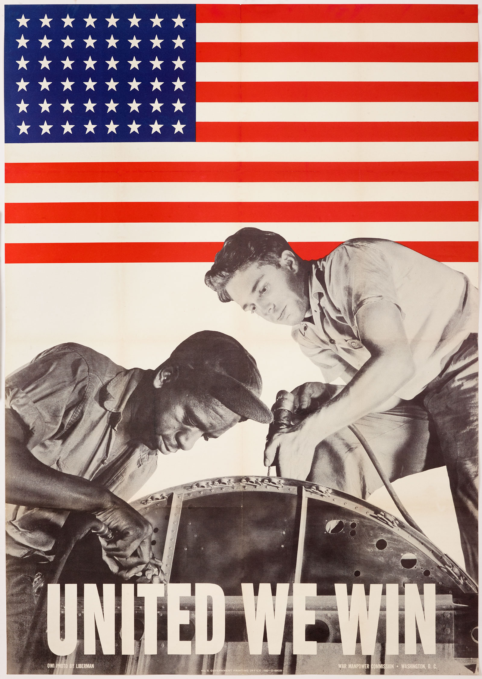
United We Win Poster
A photograph of a black man (Louis Ward) and a white man (Walter Shippe) working together at a Republic Aircraft Corporation plant is superimposed over the American flag. The message to workers is to put aside racial prejudice in the interest of the nation's war effort. During the Second World War, the huge demand for military goods and the resulting labor shortages led employers to ease segregation policies that had previously kept African Americans out of many industrial workplaces. But as black workers poured into cities and factories, they met resentment from white counterparts, who sometimes protested with "hate strikes." This poster was published in 1942 by the War Manpower Commission, and then reissued by the Office of War Information in May 1943, just a month before a race riot in Detroit left thirty-four people both black and white dead.
Dale Zine: Synthesizing photography, graphics, and text might be taken for granted with today's digital software, but here is an example where the different elements were overlaid together via analog means. The silhouetting between one of the figures and the stripes of the flag creates a sense of depth and animates the action portrayed.
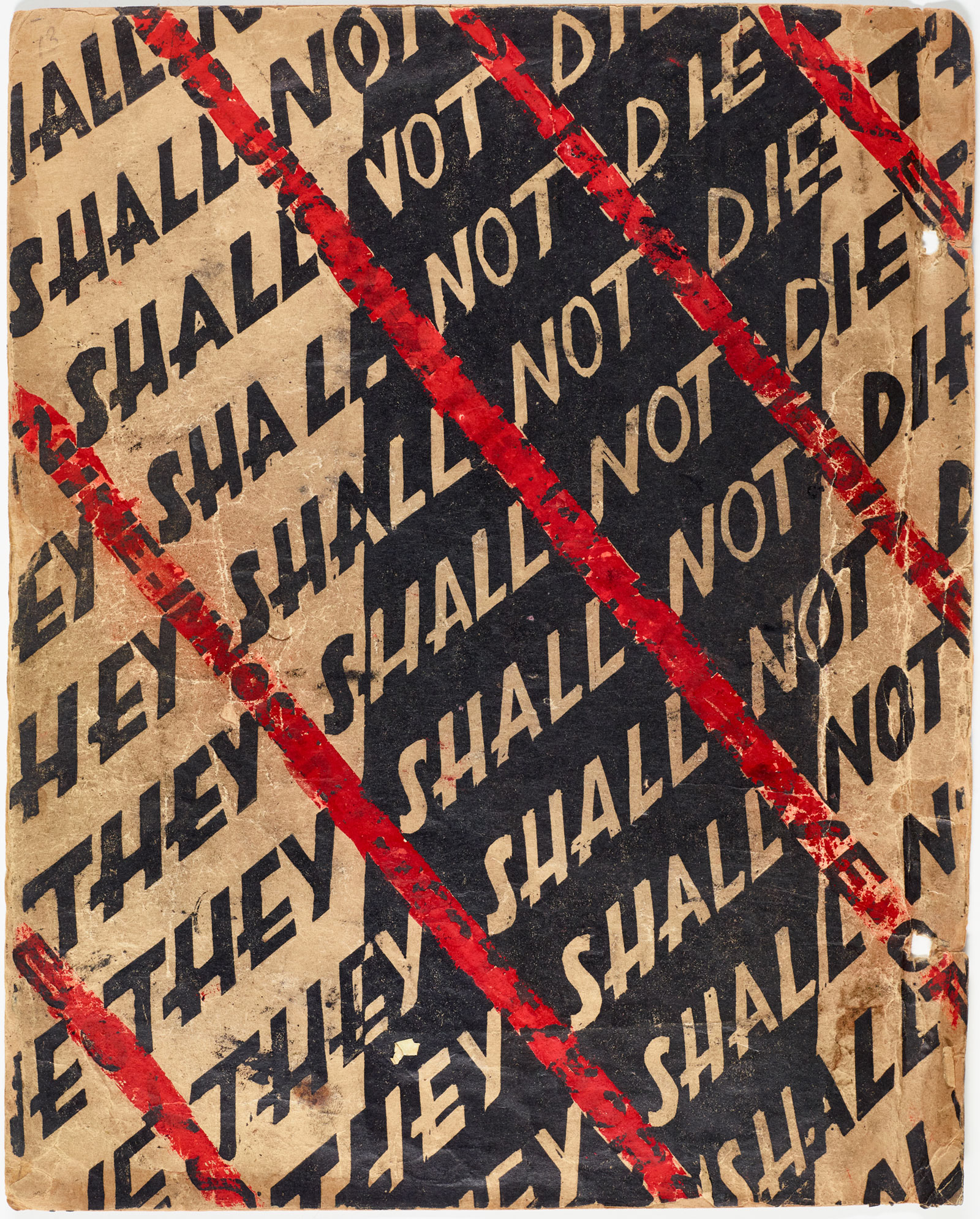
Scottsboro Manuscript
In 1931, nine black youths were falsely accused of raping two white women on a train in Scottsboro, Alabama. The resulting legal cases and their outcome prompted public outcry in light of racist motivations and questionable access to fair trials. With the aim of drawing publicity to the Scottsboro case, Communist activist-artists Lin Shi Khan and Ralph Austin prepared a mock-up for a block print book. In this unpublished manuscript, the artists presented the story in a series of visual images created using the linoleum-block technique. A striking image of an electric chair is featured on the cover.
Dale Zine: Great use of text and negative space that upon a closer look, draws you into the implicit tension of the subject revealed underneath the red ink. A clever way of developing a robust message, both direct and suggestive in its messaging.
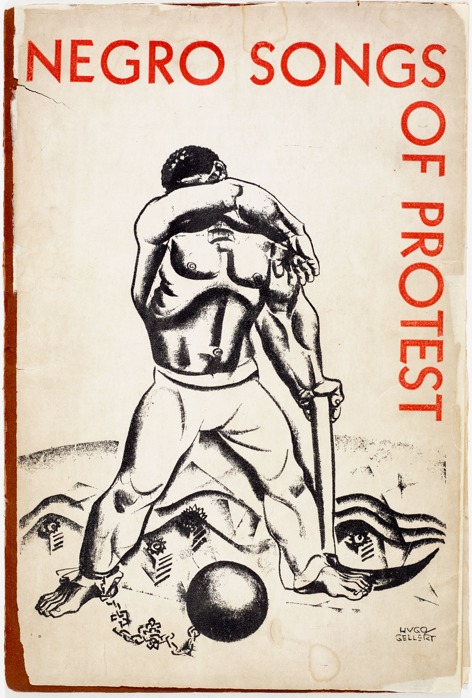
Songbook Cover
Hugo Gellert's artwork is featured on the cover of "Negro Songs of Protest," a collection of tunes sung by chain gangs, field hands, lumber jacks, and other oppressed Southern blacks. The songbook includes "Scottsboro," a song with lyrics that reminded the public that the accused boys were "All boun' in jail and framed to die" at the hands of an all-white judge and jury—the "biggety name fo' same lynchin' band."
Dale Zine: The illustration is striking and almost doesn't need a headline. Charcoal's versatility both in early sketches and more polished drawings lends this work grave expression with economical means.