Skip to Main Content

The Picture of Health

June 25, 2020

By curators Lea Nickless and Shoshana Resnikoff

Looking back, it seems early on in our "new normal" of doing museum work from home that we were suddenly on a Zoom call with Julia Knight and Bader AlAwadhi, the director and marketing manager of the Poster House museum. What fun to be transported from our Miami couches into Bader's New York apartment and Julia's rural retreat! We chatted, shared personal WFH experiences, and, finally, began to envision a collaborative remote project. 

It all started when we were in the process of writing a blog post on how graphic artists in The Wolfsonian's collection used image and text to urge, compel, and instruct during times of crisis. Learning of the Poster House and Print's project to commission designers to create contemporary responses to COVID-19, we were intrigued. What are graphic artists doing now?
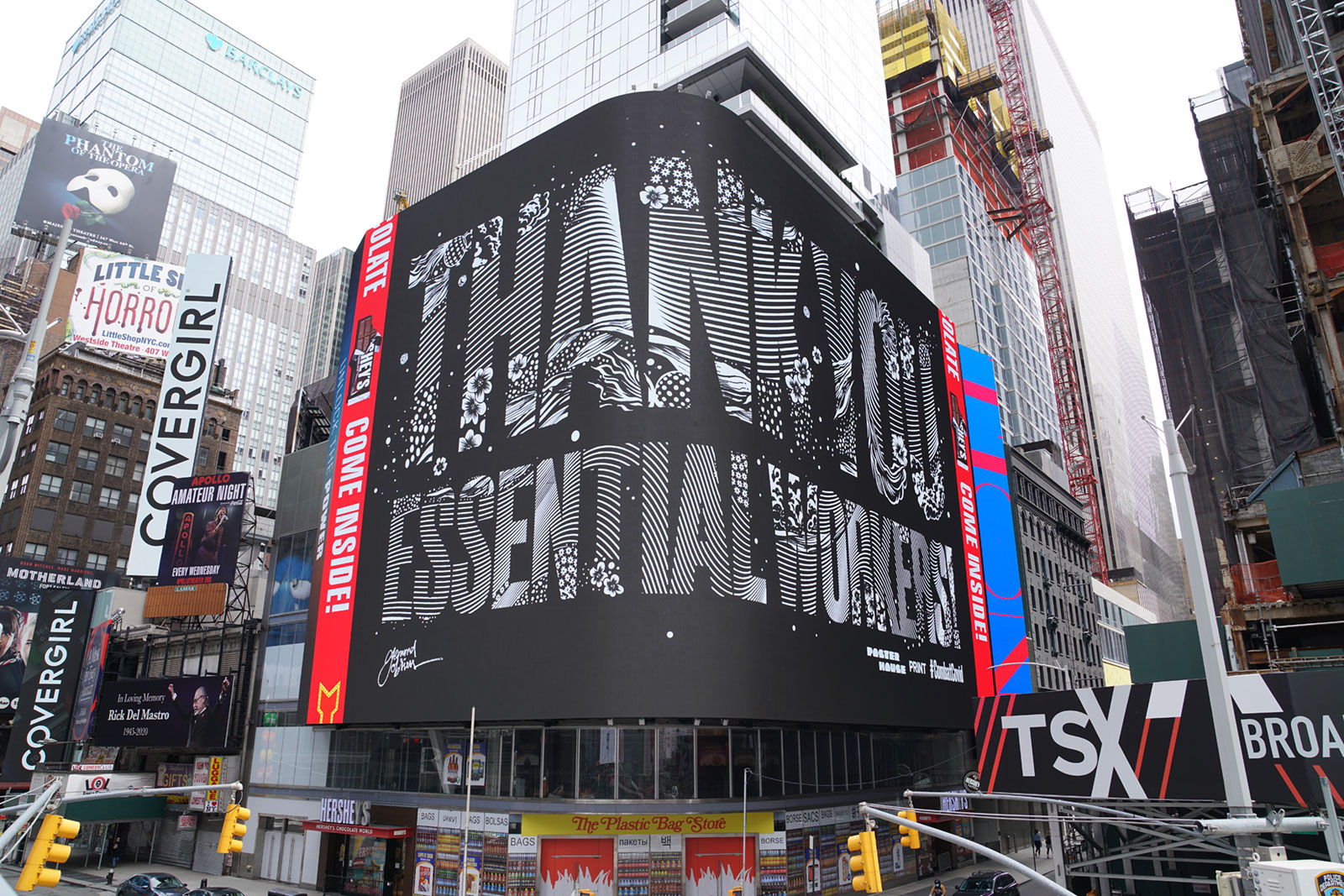
#CombatCOVID in Times Square
#CombatCOVID campaign in Times Square. Image courtesy Poster House.


Through Poster House's resourceful partnering, 1,800 billboards throughout New York City were transformed into vehicles for a massive public art awareness project, #CombatCOVID. From Times Square to bus shelters and newsstand screens to a double-sided billboard at the base of the Lincoln Tunnel, prominently displayed images and text convey public safety PSAs, messages of hope, or expressions of thanks to doctors, nurses, grocery store workers, janitorial staff, shippers, and other essential workers.
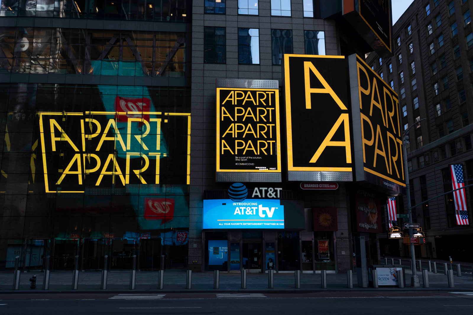
#CombatCOVID in New York City
#CombatCOVID campaign in Times Square. Image courtesy Poster House.


Inspired by Poster House's creativity and wanting to do our part, we approached Julia and Bader with an idea: why not bring these images to Miami and project them on to the façade of The Wolfsonian, turning the museum building into a billboard for pandemic solidarity? Happily, they loved the idea. Within a few weeks, we were hosting this timely project at The Wolfsonian—selections from #CombatCOVID were projected onto the Wolfsonian exterior for several weeks from May to June.
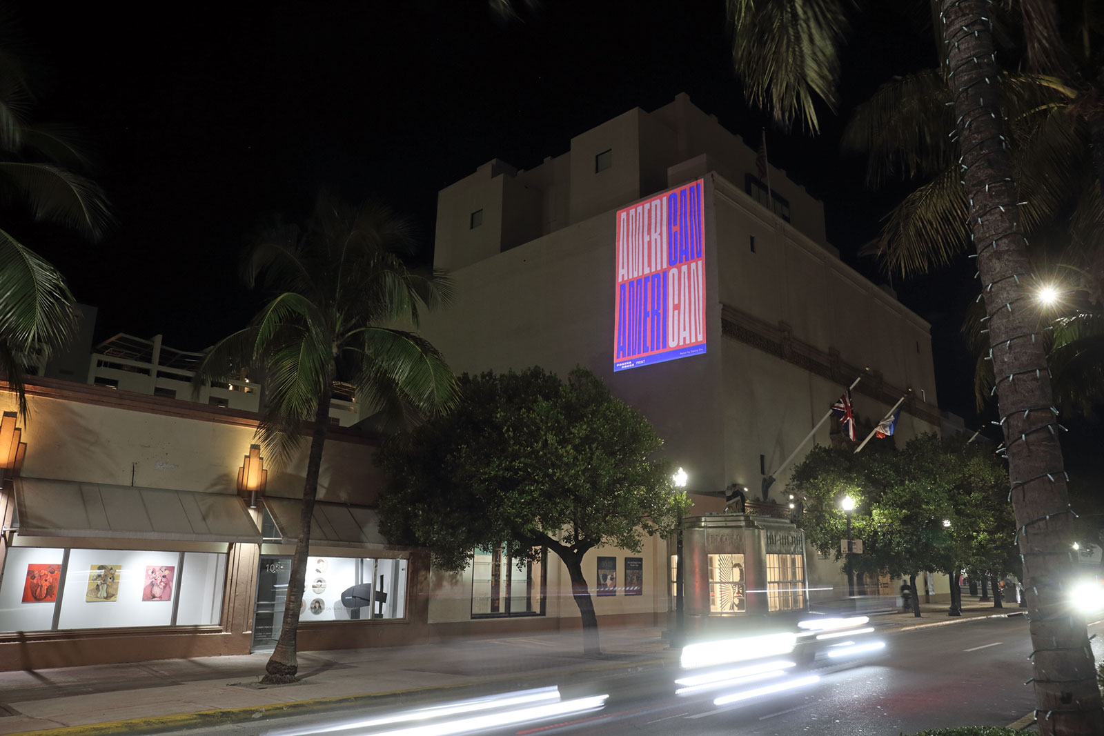
#CombatCOVID in Miami
#CombatCOVID campaign in Miami Beach.


As with our findings in the Wolfsonian collection, the works created for this project are generally strong in color, concise, and designed to be eye-catching. They carry a range of messages—guidance on how best to avoid virus transmission, exhortations to stay at home, support and gratitude to front-line workers—and project humor, urgency, and solidarity in turn. Together they remain a snapshot of these uncertain times.

Below are the posters included in Miami's iteration of #CombatCOVID, with our responses about what makes them effective.

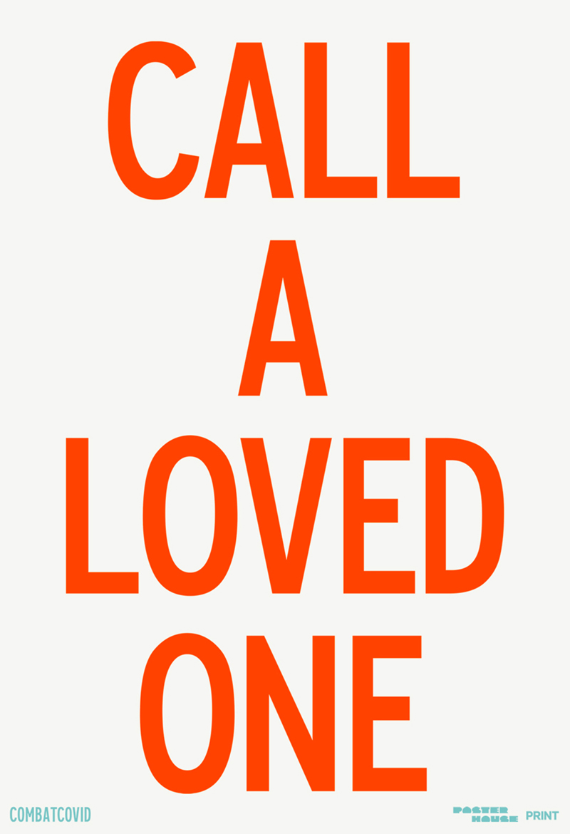
Poster by Pablo Delcan

Pablo Delcan

"Our message was about connecting with people that you love. Specially in times like these, it is the best we've all got. So, call a loved one and stay well, positive and home (if you can)." – Pablo Delcan

Spanish graphic designer Delcan’s simple statement—"call a loved one"—is made more powerful through strong lettering and high contrast. While much of the instruction around COVID-19 orients towards the physical, this reminder to find emotional connection during a time of separation is timely and timeless.

Poster by Matt Dorfman.jpg

Matt Dorfman

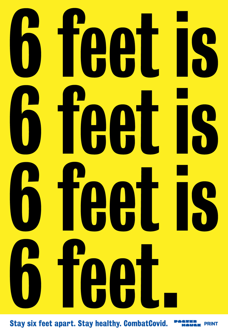
"With nearly anything else that I'm doing I'm trying to assign fine art values to a piece of design, insofar as that I'd like people to stop, sit and look at it for a little while. This particular kind of poster kind of demands for the opposite reaction. It's something that you should read and absorb and then quickly move past." – Matt Dorfman

Like Declan, Dorfman utilizes clear lettering and contrasting colors with the goal of straightforward communication. His message is an urgent reminder that certain realities remain true regardless of how we might feel or what we might want from the world around us: six feet, after all, will always be six feet.

GIF by Joe Hollier

Joe Hollier

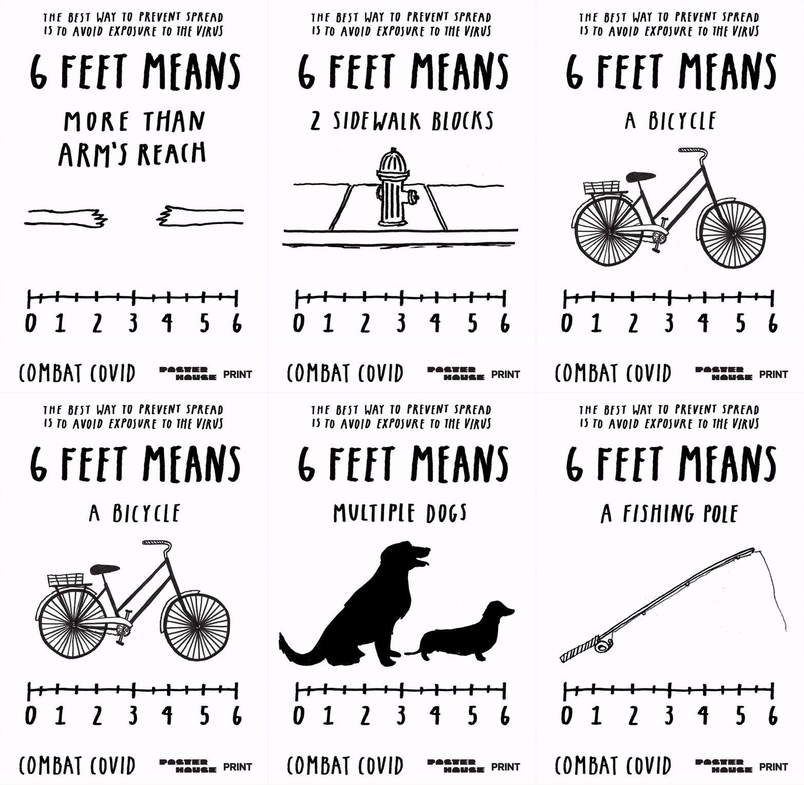
Hollier and Dorfman both remind us of the six-foot rule. While Dorfman's poster graphically reminds viewers of this safe distancing protocol, Hollier uses humor to help us measure it. In an animated GIF, Hollier's design cycles through different potential units of measurement in our COVID-19 reality.

Poster by Maira Kalman.jpg

Maira Kalman

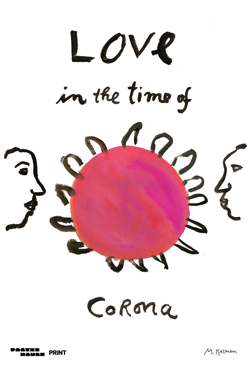
"There is nothing more important than love. We can love from a distance." – Maira Kalman

Graphic designer and artist Maira Kalman uses her signature handwriting and minimal line drawing to share a direct message. Though not instructions or guidelines, Kalman's design nonetheless can be read as exhorting the viewer to act—to love one another—with heightened awareness of the possible proximity of the virus.

Poster by Richard McGuire.jpg

Richard McGuire

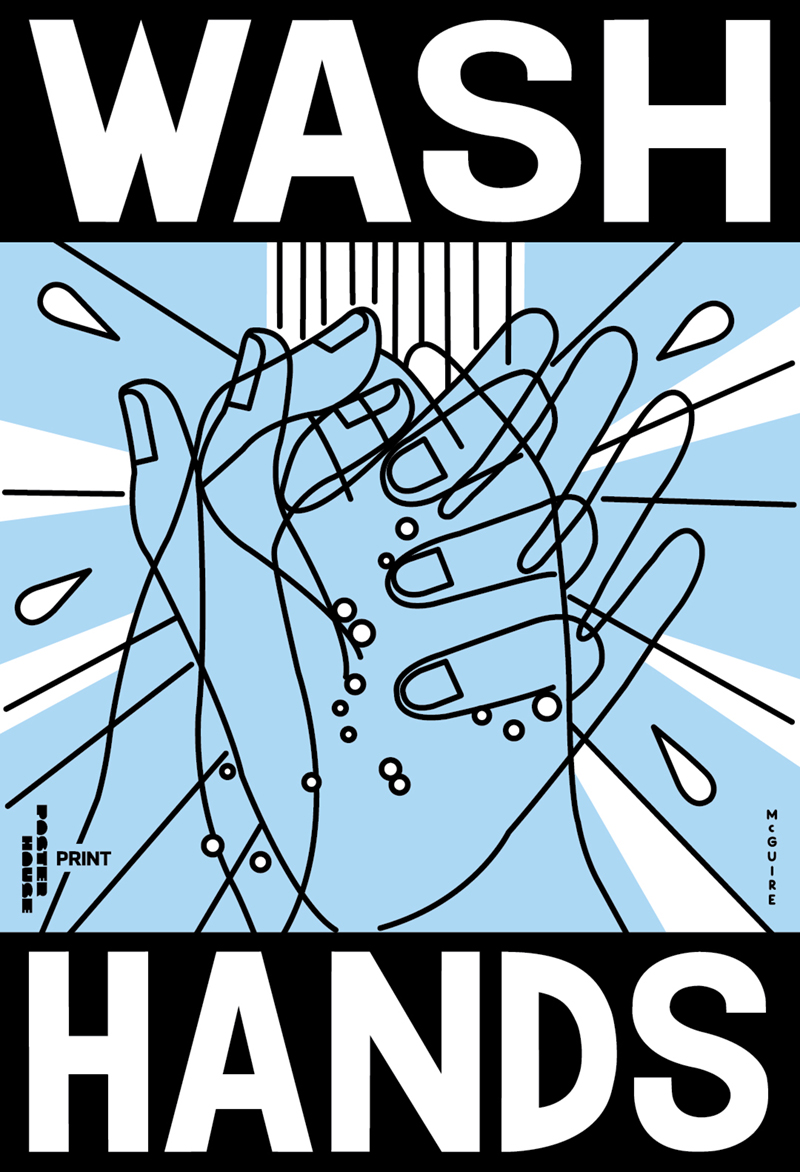
The most effective posters in the Wolfsonian collection are ones that use clear language and visuals to convey their messages. Here, designer Richard McGuire combines a simple instruction ("wash hands") with a frenetic line illustration that captures the energy with which viewers should undertake that pedestrian but vital task.

Poster by Pablo Medina.jpg

Pablo Medina

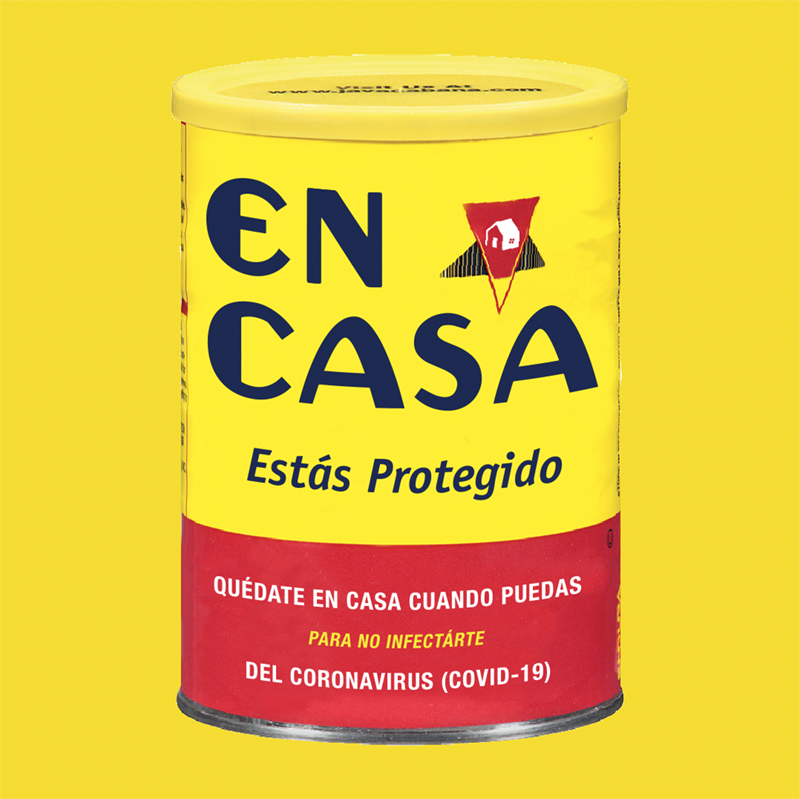
A play on the iconic Café Bustelo can, Medina's poster design urges viewers to stay safe at home. Café Bustelo has deep cultural connotations for both New Yorkers and Miamians, but the can of coffee is also a reminder that the little luxuries of the outside world—a freshly brewed and purchased cup of coffee—can be recreated at home.

Poster by Gemma O'Brien.jpg

Gemma O'Brien

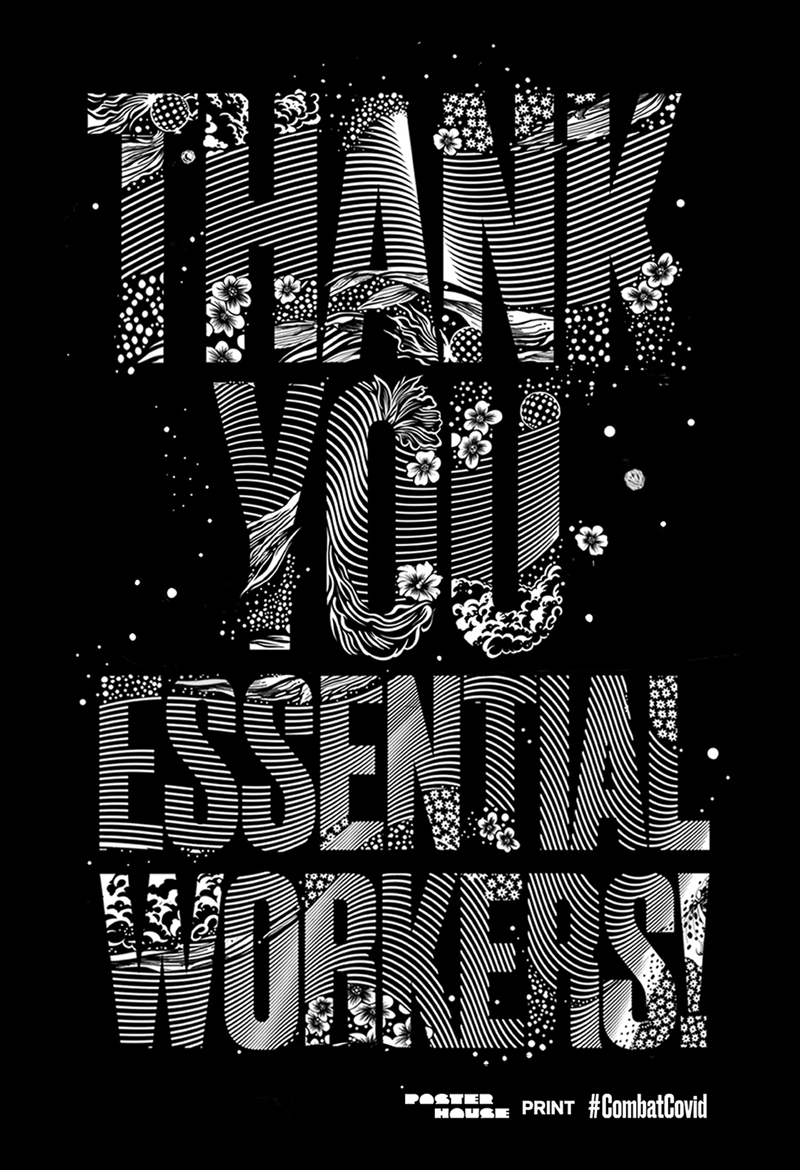
While some posters from the #CombatCOVID campaign provide instruction for physical and psychological wellbeing during the pandemic, others serve as statements of gratitude to front-line workers for their continuing hard work. Australian artist Gemma O'Brien's design in crisp black and white reads particularly well at night and in the early morning when essential workers—medical, food service, janitorial, and city service—are beginning and ending their shifts.

GIF by Emily Oberman

Emily Oberman

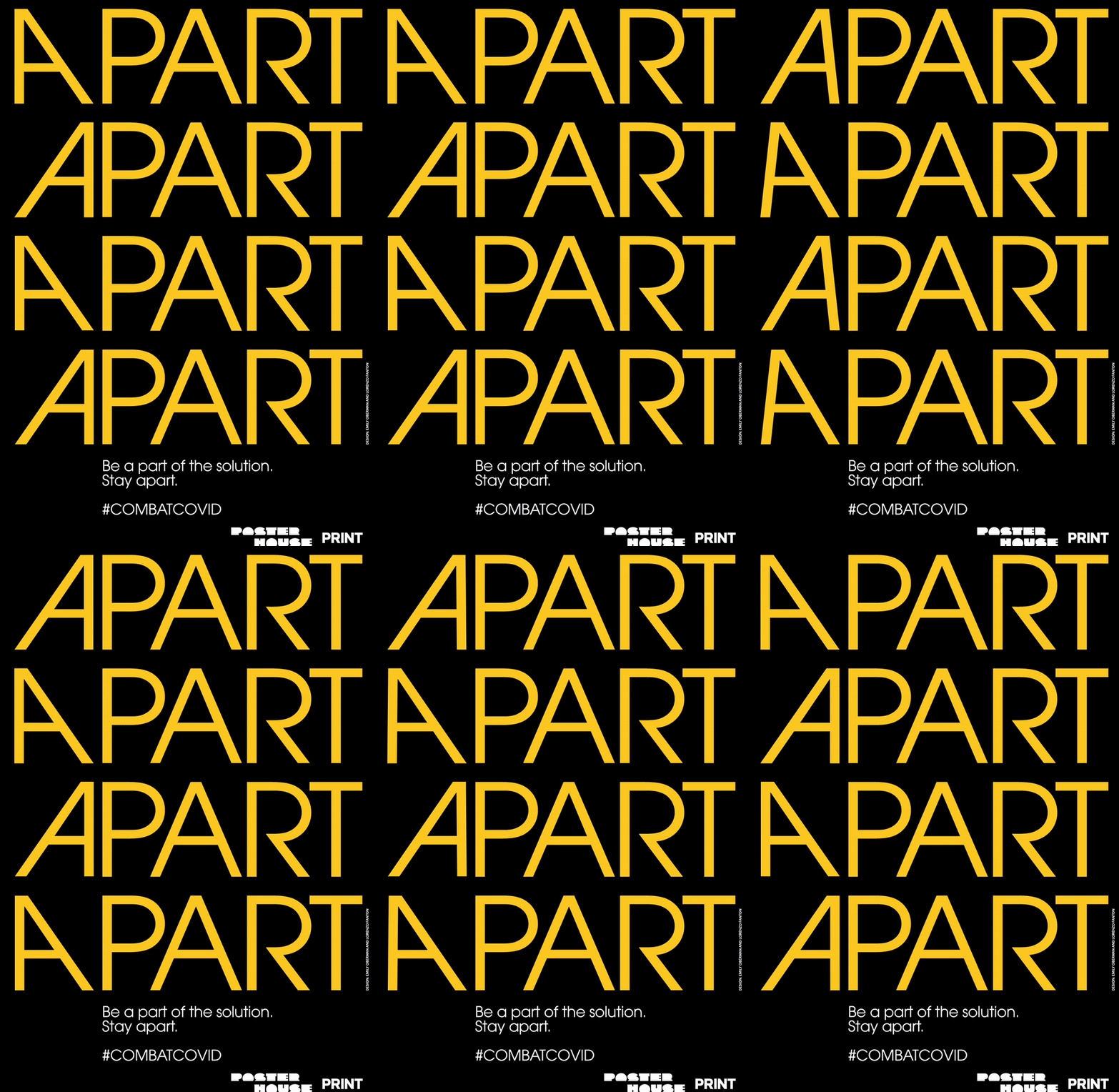
Oberman's design—another animated gif—plays up one of the great ironies of life during a pandemic: we can best support each other by staying far apart. Oberman's "A" shifts back and forth, reminding viewers that by staying separated, they make themselves a part of something bigger.

Poster by Strick & Williams.jpg

Strick & Williams

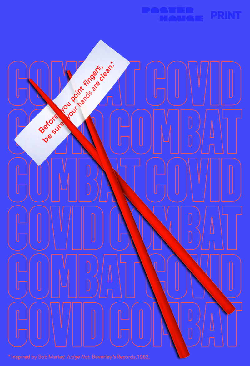
"We're very troubled by the rise in xenophobia over the world as a knee-jerk response to the spread of the virus which originated in China and wanted to create a poster that reminds us all to remember our shared humanity. This inspiring lyric by singer-songwriter and pacifist Bob Marley, 'Before you point fingers, be sure your hands are clean,' seemed the perfect fortune and reminder for this troubling time." – Charlotte Strick

Iconography is an important part of graphic design, and here designers Strick & Williams have used chopsticks as easily identifiable symbols of Chinese food in the United States. Many Chinese restaurants found themselves subject to racism and xenophobia as fear of the pandemic spread throughout the country, and the poster's use of red, white, and blue is a reminder of national ideals—aspired to, if not always lived—of tolerance and diversity.

GIF by Klaas Verplancke

Klaas Verplancke

"One could say that the more that people are disconnected, they try to find ways to connect somehow. You start to realize what you have when you miss it." – Klaas Verplancke

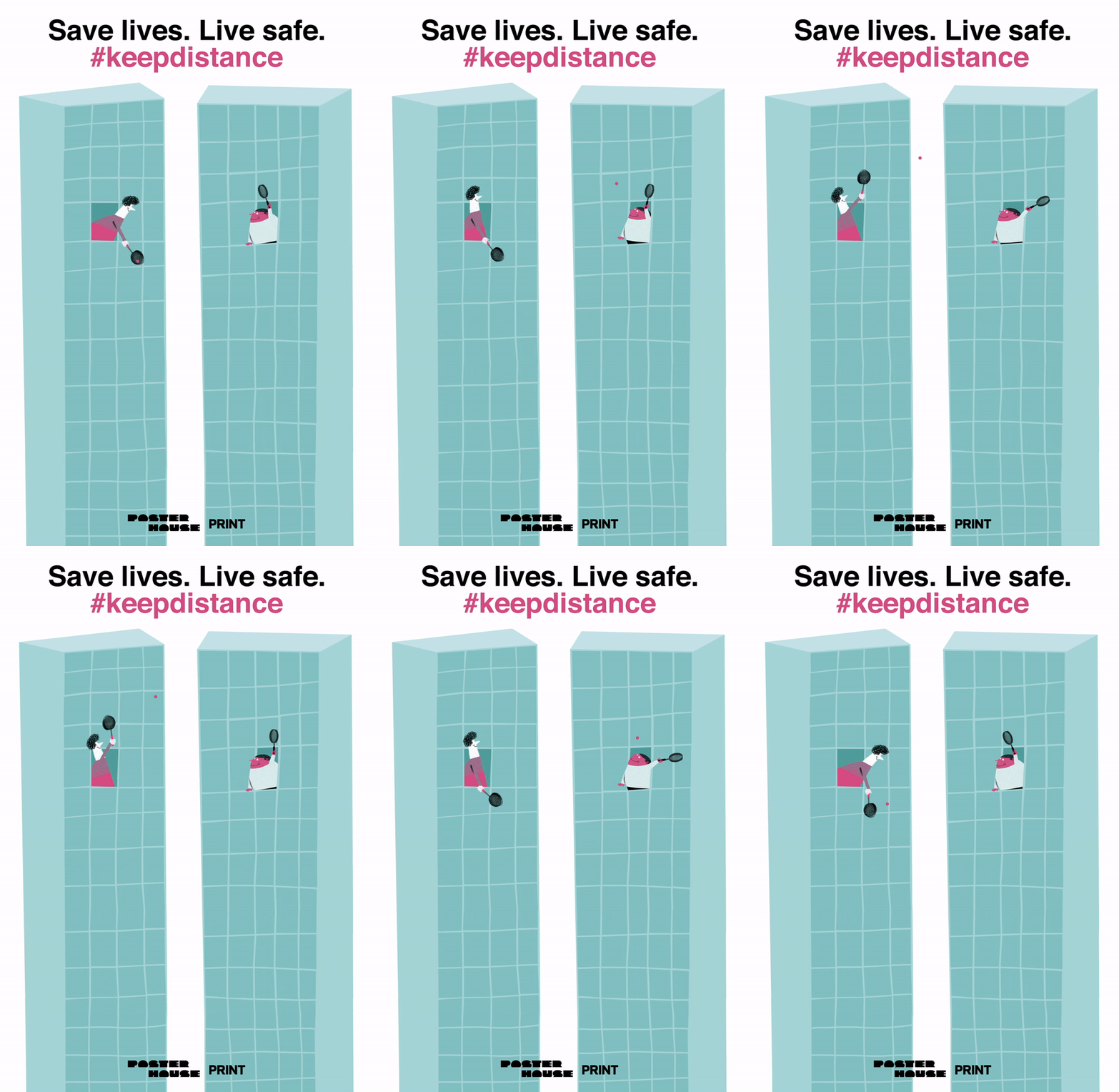
Designer Klaas Verplancke's GIF revels in the potential for humor and play during the pandemic. The cartoonish figures enjoy a game of makeshift tennis between apartment buildings, an expression of the small, domestic enjoyments and moments of remote connection available to people during trying times.

Poster by Zipeng Zhu.jpg

Zipeng Zhu

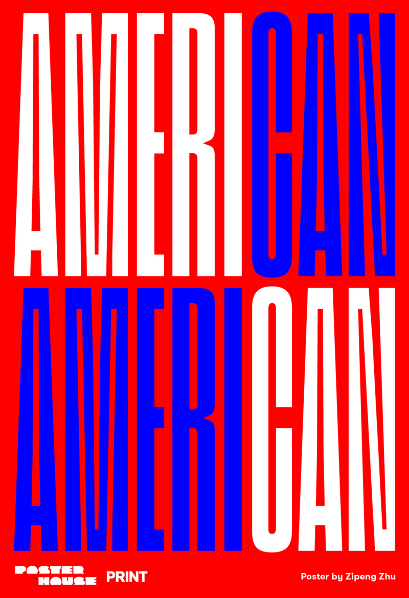
Like many of the other designers, Zipeng Zhu uses bold color and typography to quickly transmit his message of hope. Here, red, white, and blue function as color blocks, highlighting the word "CAN" in "AMERICAN." Though clearly contemporary in design, the message of resiliency hearkens back to patriotic poster designs of the Second World War.