April 10, 2020
By Curators Lea Nickless and Shoshana Resnikoff
As we live through these unprecedented times brought on by COVID-19, we realize more than ever the central role of the graphic artist in communicating information, rallying support, and building consensus. Seeing daily graphics in the media—maps of the pandemic's course, PSAs on handwashing techniques, and infographics on current statistics—we wanted to know more about how present-day graphic artists are responding to our current situation. We were in luck: our friends at the Poster House—a museum in New York City that investigates the poster as art form and social agent—will be launching a collaboration with Print that commissions designers to create contemporary graphic responses to the coronavirus. Those designs will then be displayed throughout the city and online, so that New Yorkers and digital citizens alike can encounter clear, positive messaging. Check back with us here for updates on their project.
Until then, however, we can kick off the graphic design discussion by using The Wolfsonian's holdings of posters and ephemera from the period 1850 to 1950 to explore the communication strategies commonly implemented by graphic designers during times of crisis. Turning to graphic design during difficult times is nothing new—our collection demonstrates how governments, political organizations, and international groups have long utilized visual design when there was clear need for urgent communication.
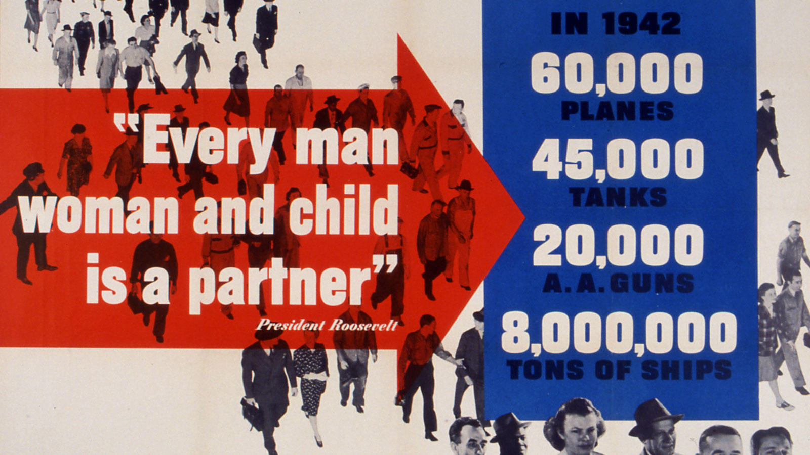
Here we will focus on three key components of effective poster design: logo, color, and imagery. Always important, these elements become even more vital when sharing critical information. In reviewing the most successful examples, we noted an overall simplicity of design, clearly presented text, a graphically strong logo, and an intentional use of color often corresponding to a particular group or movement. Also, in works relating to war or disease, we noted an increased use of the body and specific body parts.
As an aside, we like to point out that works in the Wolfsonian collection were produced by a variety of individuals for diverse organizations and entities. Some works may represent repugnant ideologies while others might contain factually incorrect information. We share them not to promote their messages, but to reflect on the ways that visual language can convey guidance, warning, and inspiration.
The National Recovery Act, called the NRA, represents a classic example of the use of set logo and text across a range of poster types and forms. In 1933, President Franklin Roosevelt launched the NRA to boost economic recovery during The Great Depression. Needing a powerful image to capture the nation's attention and communicate a shared vision for recovery, Roosevelt called Philadelphia-based graphic artist Charles Coiner to a meeting in Washington. On the flight, Coiner sketched a blue eagle in profile that was quickly adopted and came to be known as the "Recovery Eagle." In one talon, the eagle grasps a cog, a symbol of modern industry, and in the other bolts of lightning, representing electricity. The final design incorporated a patriot color scheme—the blue eagle central in a white circle on a red field, with the declaration “we do our part” in a bold sans serif font.
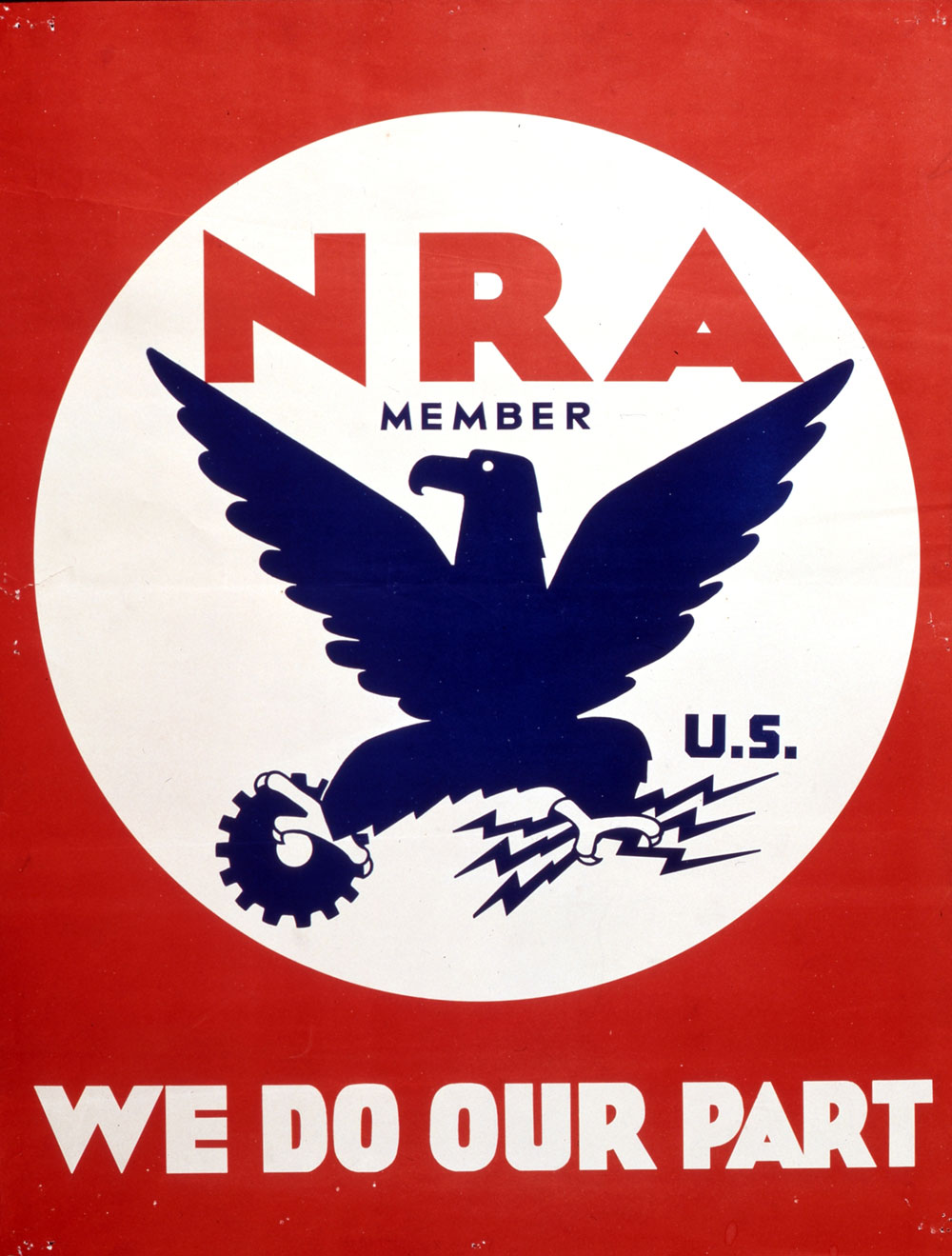
Poster, NRA We Do Our Part, 1934. Charles T. Coiner, designer. National Recovery Administration, Washington D.C., publisher. The Wolfsonian–FIU, The Mitchell Wolfson, Jr. Collection, 84.4.666.
Businesses were encouraged to become members, displaying the emblem in their windows and on their products. The logo even aired at the beginning of films of the period. Even though only in effect from 1933–35, the NRA logo remains one of the most recognizable visual images from Roosevelt's New Deal. This advertisement sign for Acme beer, a San Francisco-based brewery, displays the NRA member logo at the bottom.
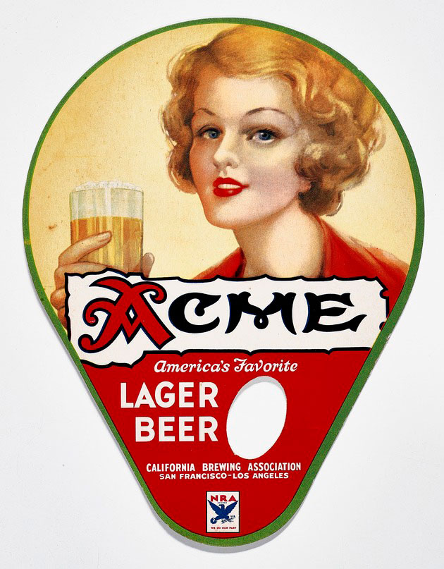
Advertisement, Acme American’s Favorite Lager Beer, c. 1934. California Brewing Association, San Francisco, publisher. The Wolfsonian–FIU, The Mitchell Wolfson, Jr. Collection, XC1991.272.
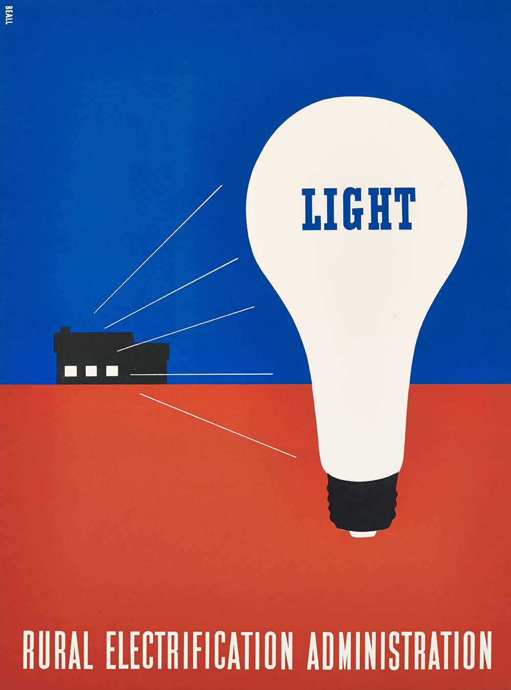
Many of the posters in the Wolfsonian collection were produced for state or political organizations during times of crisis, real or manufactured. Using strong, contrasting, and often patriotic colors, these posters were intended to hold the viewer's attention and inspire an emotional connection. In reflecting a nation's or an organization's chosen colors, the designer strove to connect on a visceral level and, in the process, brand a political movement or corporate identity. For example, Lester Beall's iconic designs for the Rural Electrification Administration—a New Deal program committed to bringing electric power to remote communities—used red, white, and blue to highlight a specific benefit of electricity, electric light, with white serving as the eye-catching detail in the form of the lightbulb.
Color is key in articulating more urgent and militant messages as well, as in the case of many posters that came out of Benito Mussolini's Fascist government in Italy. The National Fascist Party was famous for its design approach, and this study for a poster—which warned of the threat of tuberculosis and argued that the disease could only be beaten by working together under the leadership of the Fascist Party—combines the red, green, and white of the Italian flag to great effect. The double-barrel cross, a medical symbol for tuberculosis, is bound to the dagger by a white ribbon, all against a green background—effectively mimicking the fasces, the ancient Roman symbol of a bundle of rods bound with an axe coopted by the National Fascist Party as their emblem. Written on the white ribbon is a line from Mussolini's 1940 declaration of war against Great Britain and France, conflating the fight against tuberculosis with a world war.
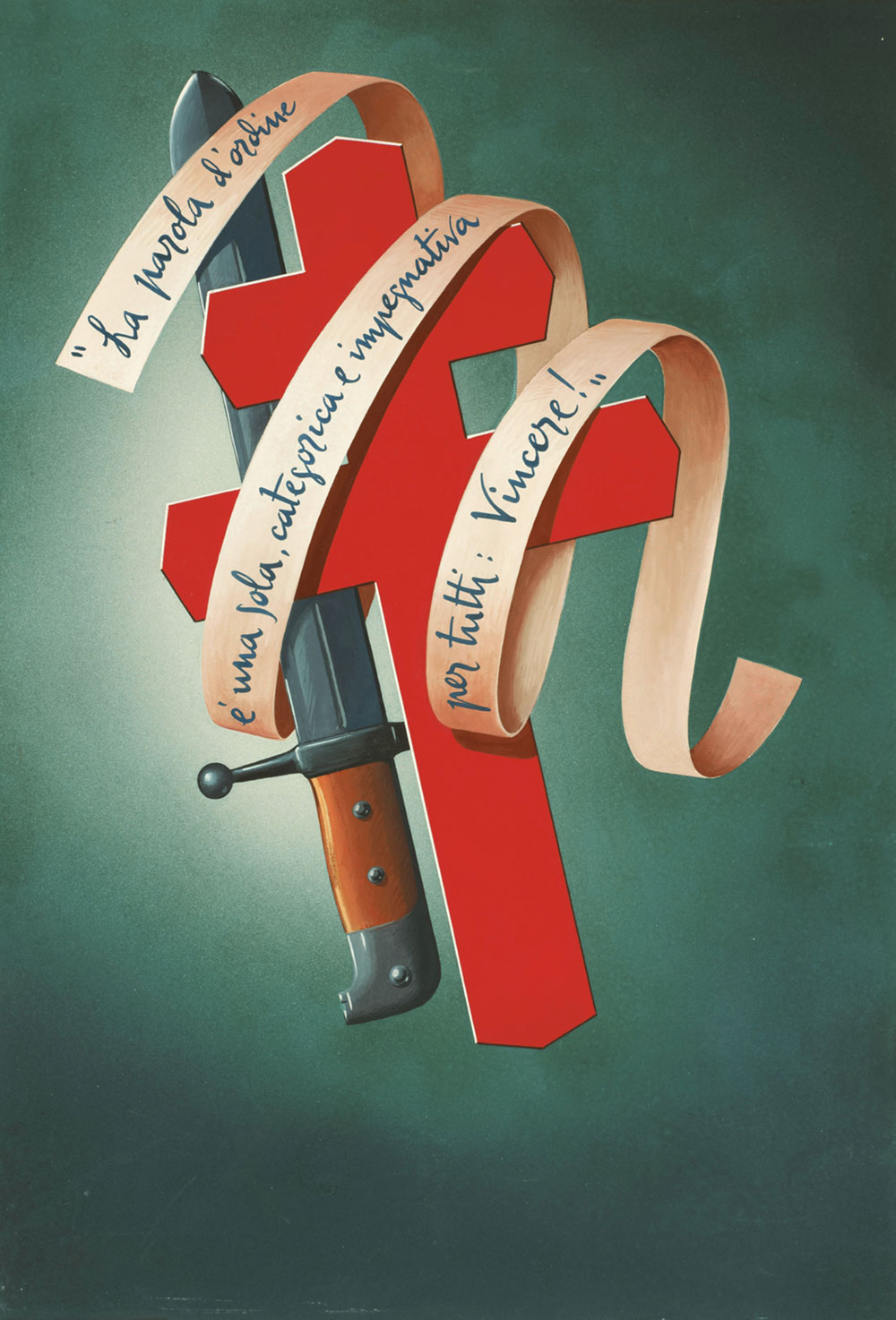
Study, La parola d'ordine é una sola, categorica e impregnativa per tutti: Vincere![The Watchword Is One Alone, Categorical and Binding for All: To Win!], 1941. Giuseppe Venturini, designer. Italy. The Wolfsonian–FIU, The Mitchell Wolfson, Jr. Collection, 84.5.30.
As symbols, bodies are particularly powerful and flexible graphic tools. They can represent humanity and individualism, but they can also become stand-ins for unity, strength, and even totalitarianism. And specific body parts have added weight: faces engender sympathy and hands are heavy with metaphor, both serving as ideal messengers during times of urgency and crisis.
Graphic designer E. McKnight Kauffer produced this poster for the Spanish Medical Aid Committee in 1937 to support British fundraising efforts on behalf of the Republican faction in the Spanish Civil War. While color plays an important role here as well—the red and black of the Republican flag intersecting in text with the white and blue of Great Britain—the focus of the poster is on the elderly face. Meant to arouse sympathy, the old man is also a layered art historical reference: Kauffer has borrowed from famed Spanish painter El Greco and his depiction of St. Luke, a physician.
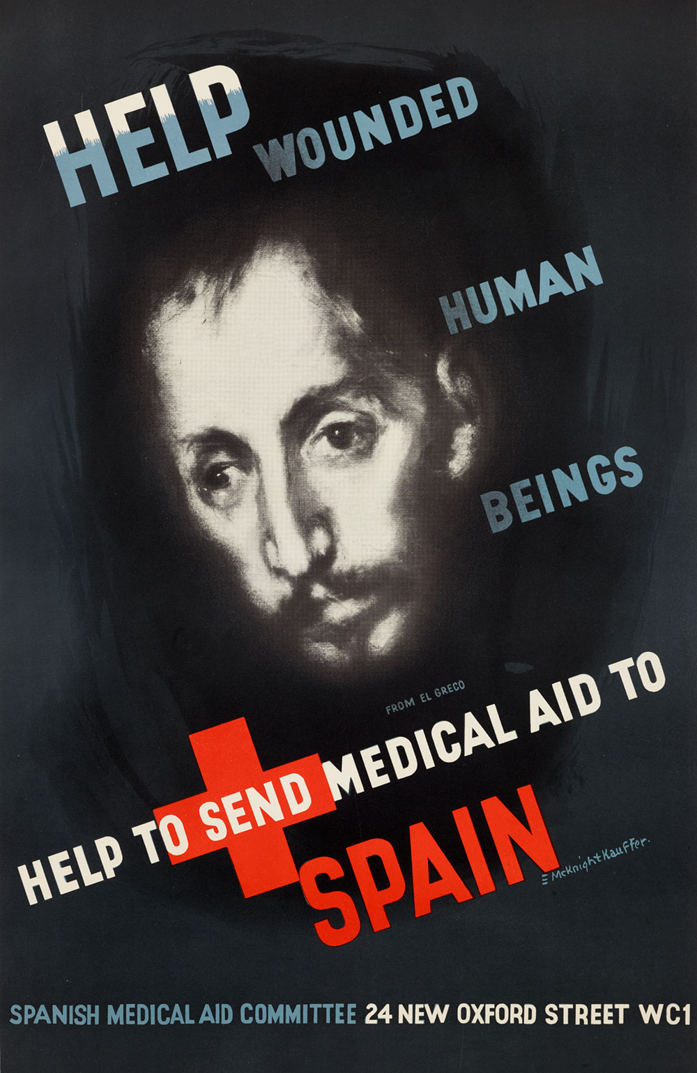
Poster, Help Wounded Human Beings, c. 1937. E. McKnight Kauffer, designer. J. Weiner Ltd., London, United Kingdom, printer. The Wolfsonian–FIU, Purchase, 2017.3.5.
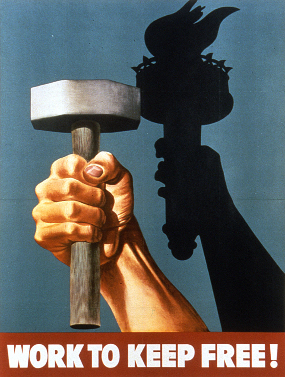
A poster from the Second World War, Work to Keep Free, takes its theme as production. Here, though, the War Production Board equates the hand grasping a mallet with Lady Liberty and her torch. The hand—large and masculine—becomes in this poster an agent of freedom.
One final example comes from the First World War. Designed by P. G. Morgan in support of Red Cross fundraising efforts, Keep This Hand of Mercy at Its Work explores the softer side of the hand as visual metaphor. An arm, clad in medical white and with a red cross patch, bisects the plane of the poster, protecting the figures on the right from the violence on the left. The hand—slender and potentially female—cups injured soldiers gently. This hand is protective and sheltering, a humane presence in an inhumane war.
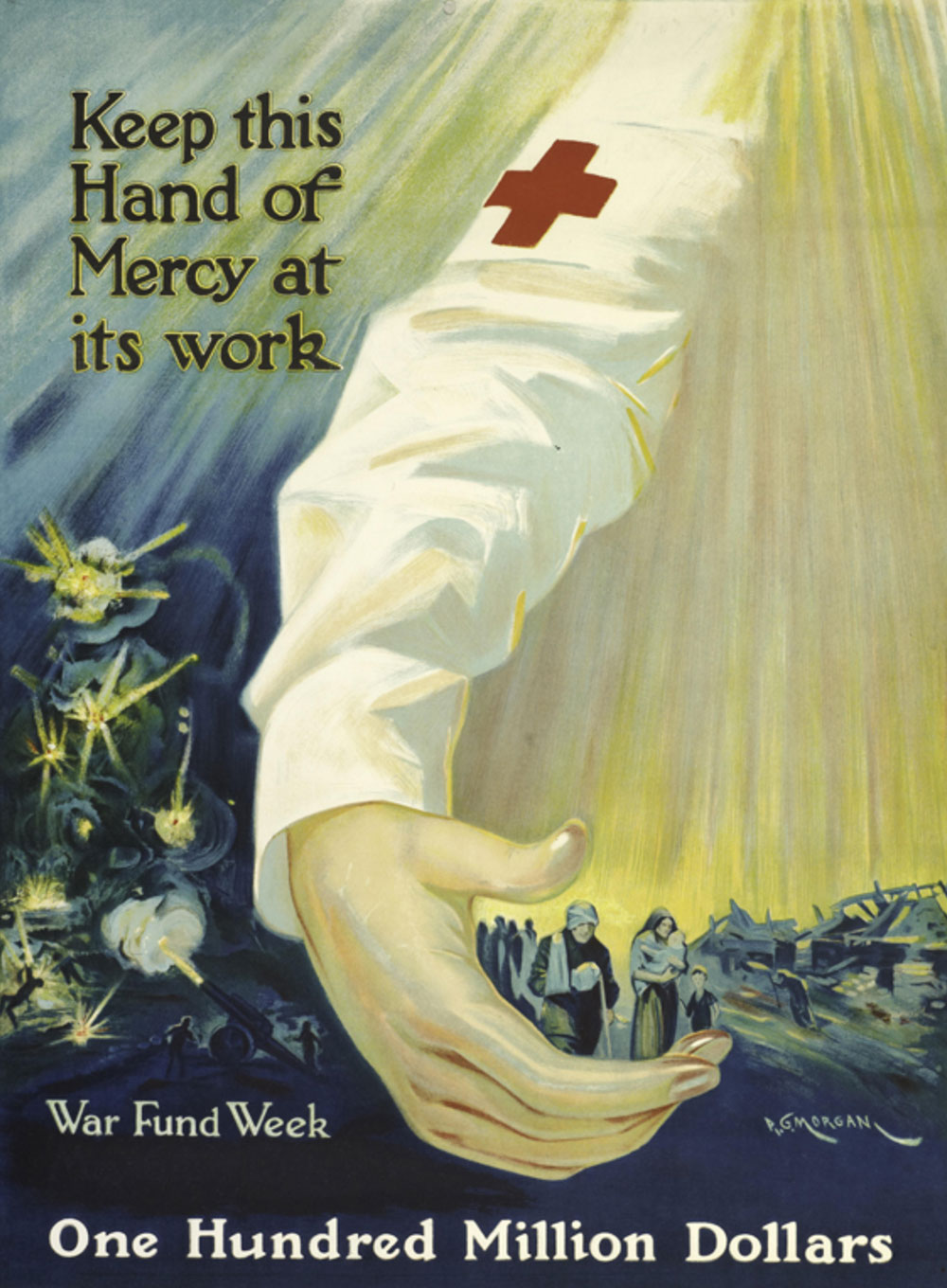
Poster, Keep This Hand of Mercy at Its Work, 1918. P. G. Morgan, designer. New York City. The Wolfsonian–FIU, Gift of Henry S. Hacker, 2010.23.155.
From this brief overview of The Wolfsonian's collection, it is clear that graphic designers have played key roles in global crises, as their work has served to persuade, inform, prevent, and protect, guiding the choices we make. So, as you go about your day, remember: wash your hands, keep your distance, and please be safe.
